Website testimonials from real customers show visitors that your product or service delivers on its promises.
It can take a lot to convert website visitors, especially if they’re new to your brand. Customer testimonials offer evidence that your company can be trusted and that what you offer is worth a look.
How you present this social proof will depend on your industry. B2B companies often share case studies, SaaS platforms highlight specific features, ecommerce sites showcase customer photos and reviews, and freelancers build trust through detailed client testimonials.
Whatever category you fall into, testimonials convert best when they feel authentic and are positioned thoughtfully. In this article, we’ll look at 12 of the best website testimonial examples and share some advice for your own site’s design. We’ll also explore how AI is changing the way businesses collect and display testimonials.
12 best testimonial examples
These websites showcase testimonials in a way that grabs attention and builds trust. Here’s how each takes a thoughtful approach to displaying authentic customer feedback.
1. Petal
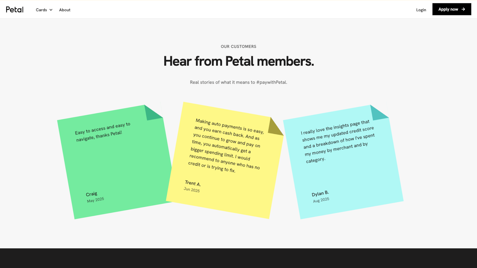
Petal, designed by Devin Fountain, displays testimonials on colorful sticky notes — green, yellow, and blue — that match Petal’s brand colors. The sticky note format keeps the customer feedback genuine by making it clear that these are real, unfiltered opinions.
The reviews address specific concerns new users might have, such as anxiety about applying for Petal’s credit cards after being rejected by other financial institutions. Each note shows first names and last initials, along with the month the customer left the review. This is enough detail to show that these are actual buyers without sharing full names on a sensitive topic.
2. Moris Design Co.
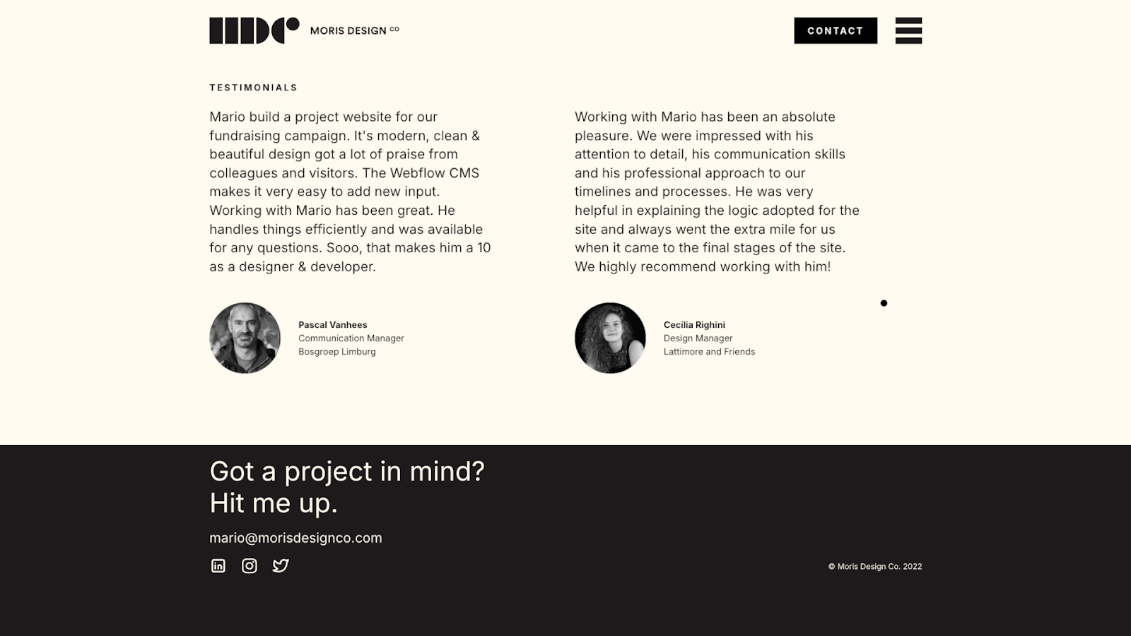
Moris Design Co. shows two client testimonials side by side, each including a circular profile photo, the person’s full name, their job title, and the company name. The reviews focus on the experience of working with Mario, the designer behind the site, rather than the final product. The quotes are minimally edited in a way that makes the praise feel genuine.
For freelancers, potential clients often care about the individual’s history and the collaboration experience as much as the end result. These testimonials let visitors know what Mario is like, and the full names and professional details make these endorsements verifiable.
3. Valo Motion
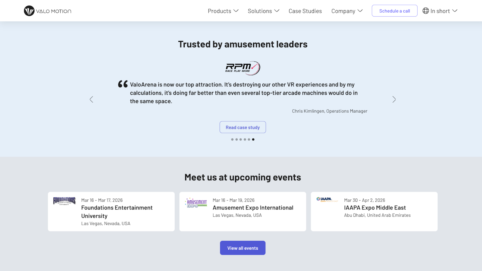
Valo Motion’s website, designed by Félix Meens, showcases testimonials from amusement park and entertainment center operators in a full-width carousel. Each testimonial is a short quote, with navigation arrows that let visitors switch between them quickly.
Some of the quotes address specific concerns, while others describe successful experiences. This way, a visitor is more likely to find a testimonial that fits their situation. There’s also a “Read case study” call-to-action (CTA) button that takes visitors to the complete story behind each quote.
4. Amrit Palace
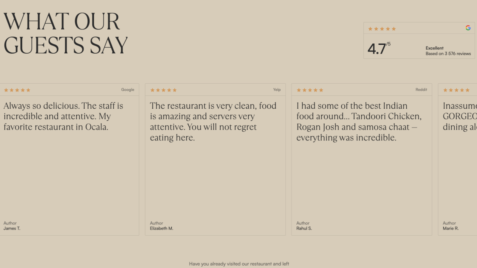
Amrit Palace showcases testimonials in a horizontal carousel, with a beige background that matches the rest of the site’s branding. The top-right corner displays a Google badge. Each testimonial card shows the rating, review text, original platform (Yelp, Google Reviews, etc.), and the customer’s first name and last initial. In particular, the variety of testimonial sources shows that people across multiple sites say similar things about Amrit Palace’s food and service.
Despite the site’s overall polished design, the reviews appear unedited and include typos. These imperfections and the casual phrasing make the reviews feel authentic, which likely matters more to potential diners than perfect grammar.
5. Everything Design
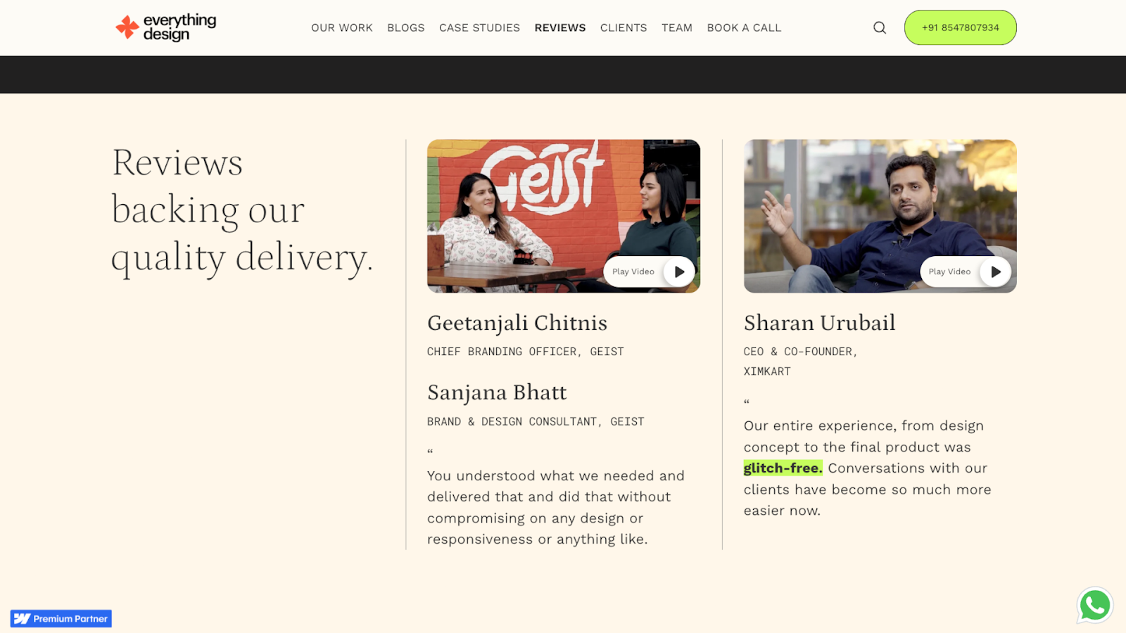
Everything Design features video testimonials, each on a card that shows a thumbnail image of the person speaking, along with their name, job title, company, and a “Play Video” button overlay. The page is clearly divided into sections, organizing testimonials by topic so visitors can find what interests them.
Video testimonials often carry more weight than text reviews — seeing happy customers speak directly to the camera can be especially credible and engaging. It’s harder to fake enthusiasm in a video, and potential clients can read body language and tone to gauge sincerity. Still, Everything Design also includes text quotes, emphasizing the key benefits of their service for those who prefer to read.


Show off your work.
Choose from fully customizable portfolio templates built for creatives. With Webflow, you can design, refine, and publish a standout portfolio — without writing a single line of code.
6. Charlie Croker
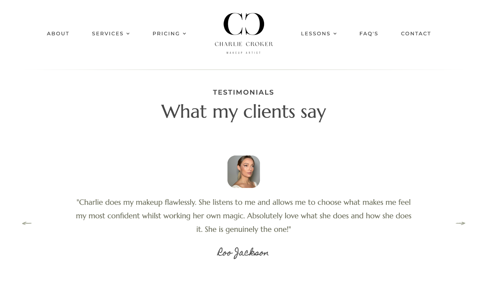
Charlie Croker’s website, designed by Modal Digital, displays client testimonials in a carousel with an off-white background and a minimalist design. Each testimonial shows a photo of the client at the top, followed by their feedback and name. The name is in a handwritten-style script at the bottom, making the stories feel personal.
There are only a few testimonials, but they strategically tackle different client priorities, such as fears of being rushed and ethical product concerns. This gives potential clients immediate answers to a few crucial questions and shows that Charlie treats each of her customers with individual care.
7. Vale Tudo Training
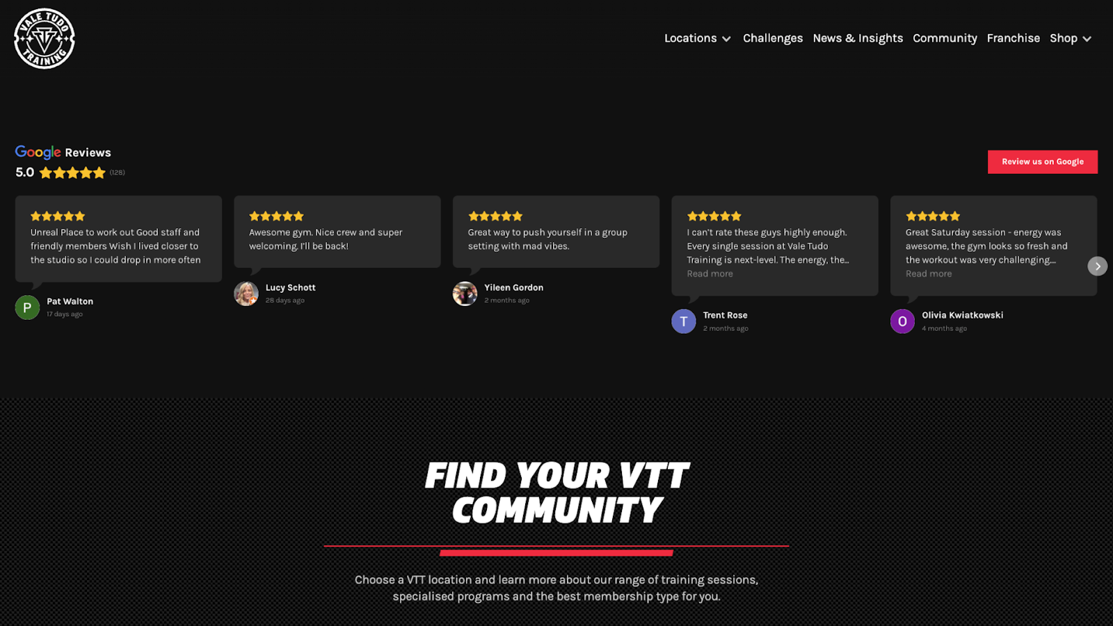
Vale Tudo Training’s site, designed by Richard Lam, integrates Google Reviews directly on the homepage, using a dark background that matches their MMA training gym branding. Each card displays five stars, a snippet of the review text with a “Read more” link, the reviewer’s profile photo or icon, a name, and a posting date.
The amount of detail and use of third-party reviews enhances the testimonials’ credibility. Also, the company’s high average rating is front and center, showing potential members that the gym’s quality stays consistent across many experiences.
8. Core Visuals
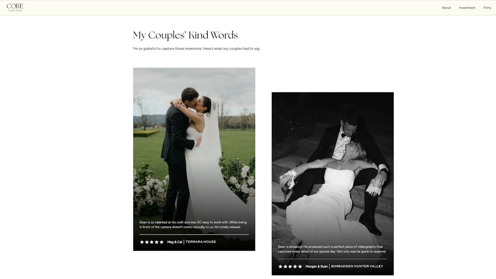
Core Visuals, a wedding videography company with a site designed by webchief, displays testimonials in white text beneath wedding photos of happy couples. The photos prove that this videographer can capture beautiful moments. The text explains what working with Core Visuals is like and how satisfied customers are with the results. The reviews also include traditional star ratings, so visitors can see at a glance how positive the feedback is.
The content in these testimonials focuses more on the experience than the final product, which is a smart choice for a wedding vendor. Couples booking a videographer need to know this person will show up on time and blend into the day without causing problems.
9. Passion Exteriors
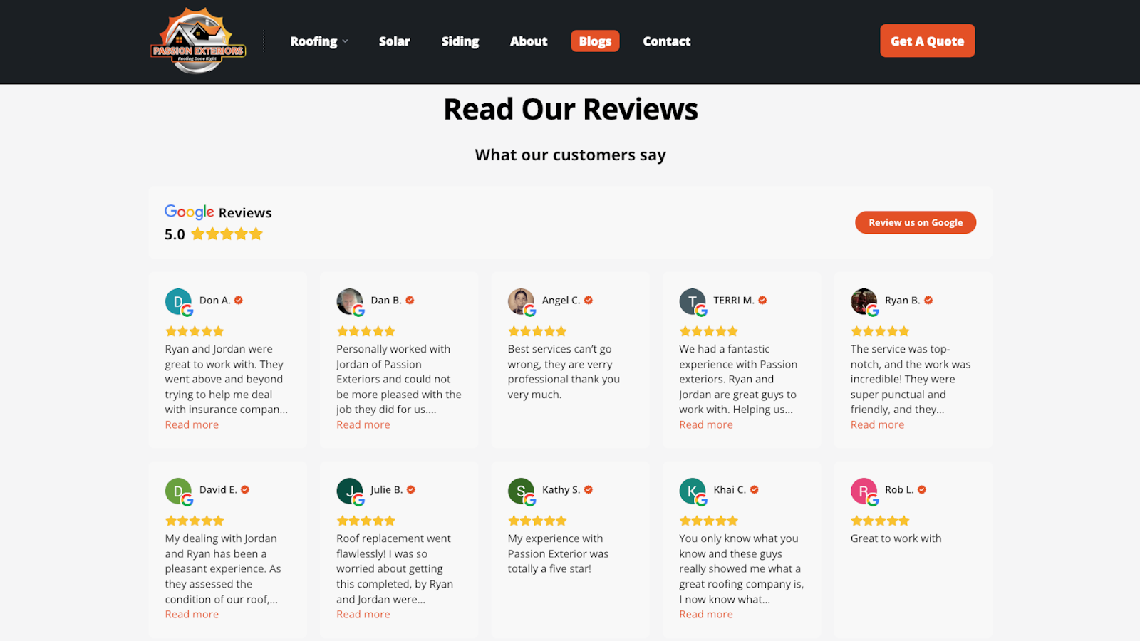
Passion Exteriors is a roofing and exterior renovation company. Their site features Google reviews displayed in a grid layout. The reviews are unedited and casual, so they appear genuine, and they’re immediately followed by a contact form so impressed visitors can reach out.
There are 15 reviews on screen at once, with the option to load more, so you can quickly see what multiple customers say without clicking through slides. For a roofing company where trust matters a lot — people spend thousands of dollars and let contractors onto their properties — seeing many good reviews echoing similar points is more impactful than reading one perfect testimonial.
10. Ruh Care
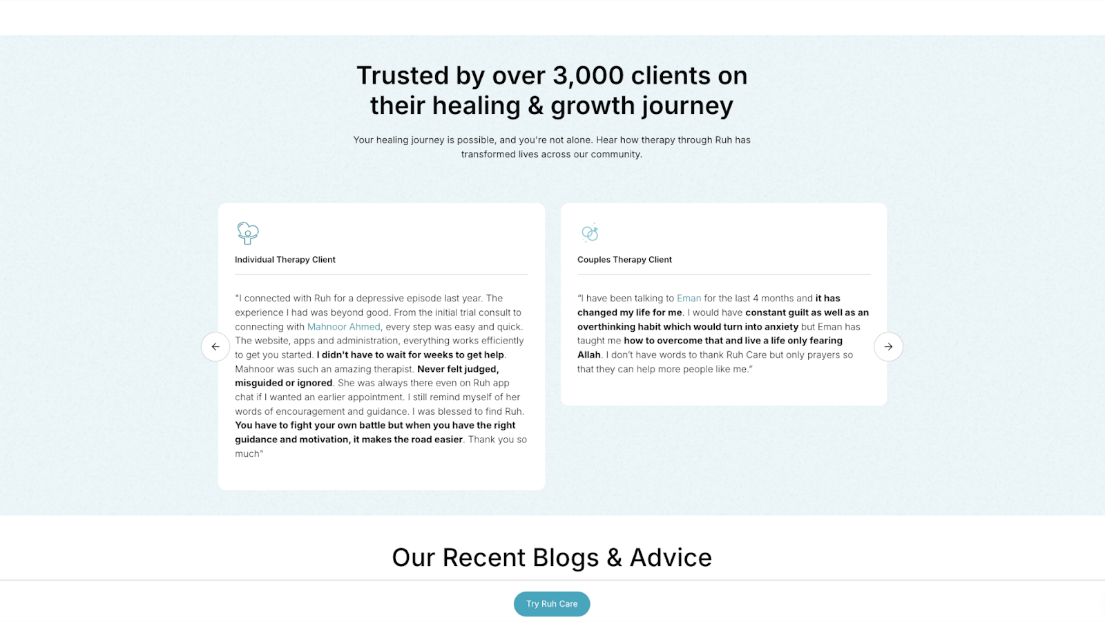
Ruh Care’s website, designed by Mubarak Bello, displays testimonials in a carousel format with cards that show each client’s type, such as “individual therapy client” and “couples therapy client.” Key phrases are bolded, making the sometimes lengthy stories easier to scan. Labels categorize the testimonials by type, so visitors can read feedback from people in similar situations.
The cards don’t include names or photos, which protects customer privacy on the sensitive topic of mental health. For a therapy practice, keeping clients anonymous matters more than attribution. This setup reassures potential customers that their information will stay safe.
11. Florence Planchenault
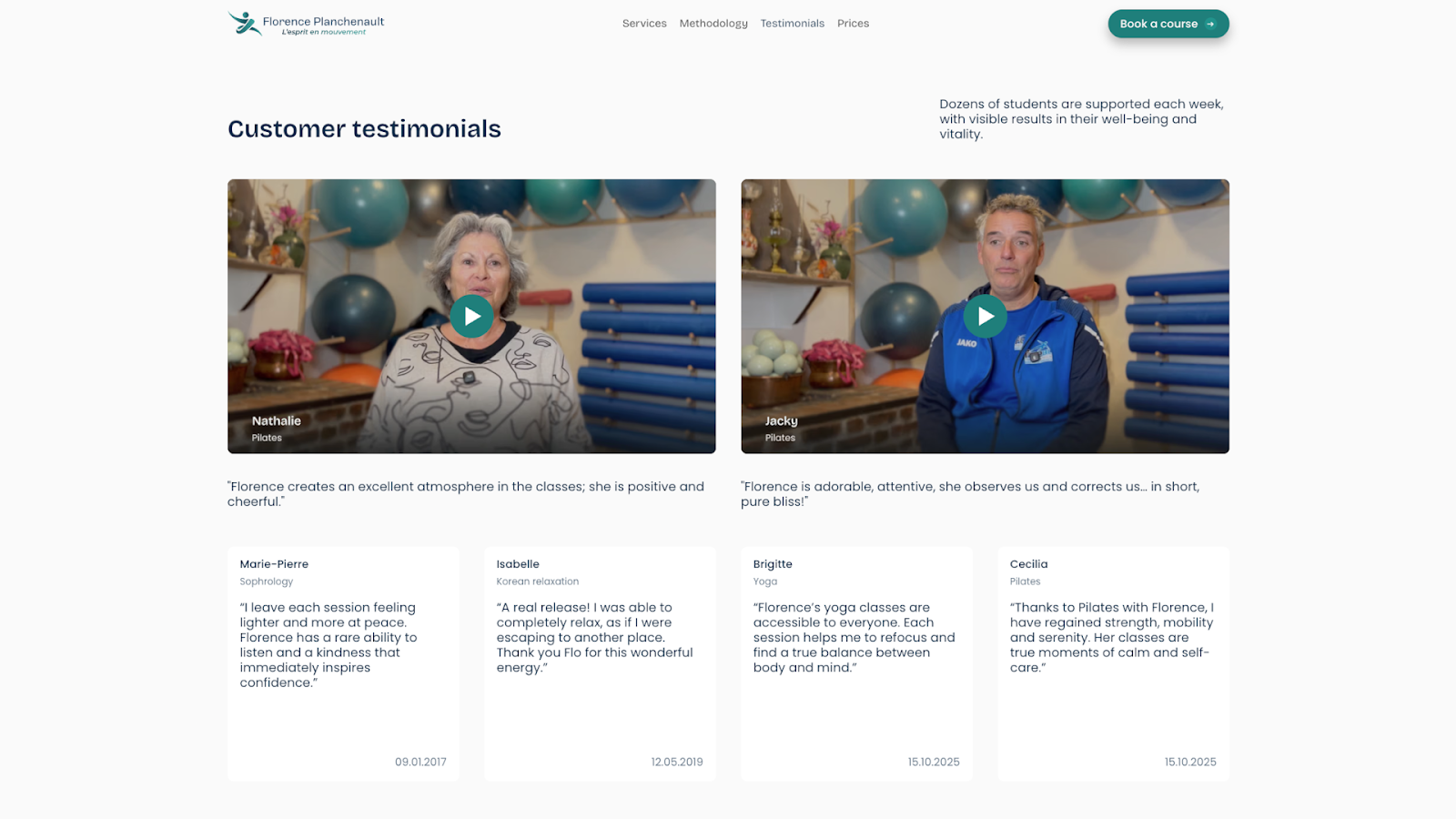
Florence Planchenault, a fitness coach based in France, features video testimonials from satisfied customers on the website Noqode designed. Each thumbnail shows the client speaking directly to the camera, with studio equipment visible in the background. A quote gives visitors a feel for what each testimonial is about.
The videos are short, and clients appear in their workout clothes, talking about their experiences directly. Watching someone who looks like you talk about their progress is more convincing and builds credibility faster than a polished but impersonal text paragraph.
12. Insider
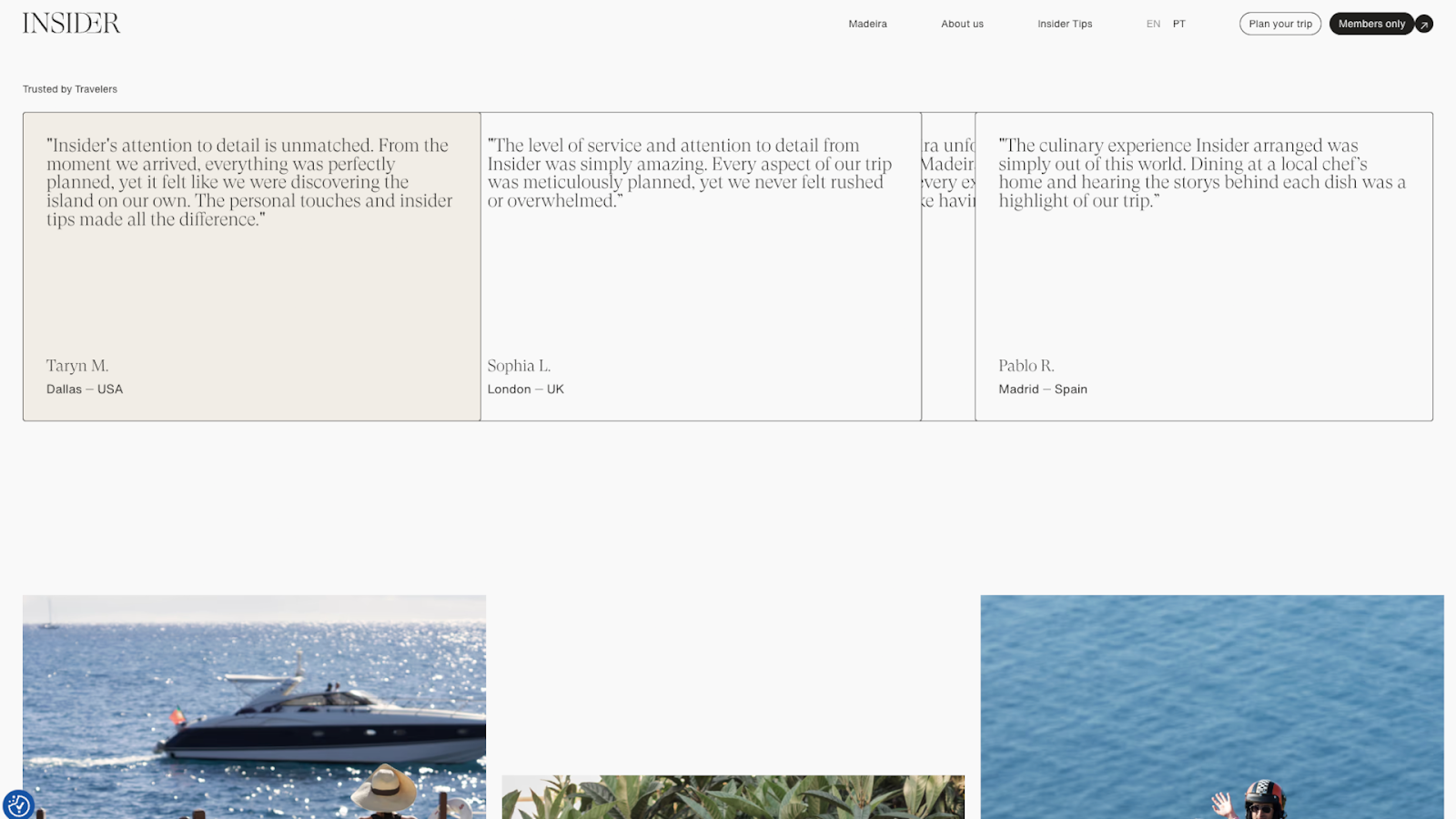
Insider, designed by Pedro Neves, showcases customer testimonials in a horizontal grid, with thin borders separating each card. When you hover over a card, the testimonial expands so you can read the complete review. This engaging bit of interaction saves space and keeps the page clean without hiding information from people who want to read more.
Each testimonial explains where the customer is from, showing that this travel agency attracts international clients. The rest of the review content emphasizes the company’s personalized local experiences, distinguishing their service from more generic tourist packages.
Why testimonials matter in modern web design
Here are a few benefits of adding testimonials like the ones featured above to your site.
Boost conversion and engagement rates
Testimonials can be more engaging than feature lists, because they share real stories that help visitors see how the product might improve their lives. When potential customers see that people like them are happy with their purchase, trying something out feels safer. Research shows this can result in up to a 70% increase in conversions.
Enhance brand credibility and authenticity
People are more likely to trust ecommerce companies after reading positive testimonials from satisfied customers, not biased sales copy. A customer testimonial comes from someone who has nothing to gain by praising you, so it’s more trustworthy. When that testimonial includes real information, such as a name and picture, those details show that an actual person is willing to stand publicly behind their review.
Improve SEO through content updates
New testimonials add fresh content to your site, which is a positive SEO signal. Also, when happy customers describe what they bought or what problem your product solved, they’ll use similar words to what new visitors might type into Google. This helps search engine bots show your site to relevant audiences.
How to gather and display website testimonials: 3 tips
Here are some best practices for testimonial design and placement.
1. Ask for testimonials directly and often
Start with the customers who’ve already expressed positive sentiment. When someone praises your work in a meeting or sends you a nice email, ask them for a testimonial. If your business is new and you don’t have many clients yet, you can use customer feedback about individual team members’ past work.
You can also email your full customer list, asking for feedback — offer a discount code or a small gift if you want to boost response rates. Social media comments and reviews from sites, such as Google and Yelp, work, too, but contact each person first and get their permission before you copy their words onto your site.
2. Design authentic, professional testimonial sections
As you get testimonials ready for display, keep these guidelines in mind:
- Make testimonials concise and authentic. Cut reviews down to a few sentences but keep the customer’s voice intact. A review that sounds too polished reads like marketing material, not real feedback.
- Include customer details where possible. B2B companies should include names, job titles, and company logos. Most others should aim for at least a name and photo, as long as the customer is comfortable with that, although some industries, such as healthcare, must prioritize anonymity.
- Use whitespace and minimalist typography. Pick a font that’s easy to read and give each testimonial enough breathing room so the page doesn’t feel cramped.
- Combine text, video, and star ratings for multi-format proof. Some visitors want to watch a video, while others scan star ratings or prefer to dive into detailed case studies. Offer various options so people get the social proof they’re looking for, and conduct A/B tests to see which types encourage click-throughs.
- Ensure accessibility. Make sure your text contrasts with backgrounds for readability, add alt text to images and videos, and test with screen readers so you know all visitors can understand the testimonials.
3. Display testimonials prominently and strategically
Consider adding testimonials to your homepage or main landing page so they’re immediately noticeable. If you’ve collected a lot of reviews, you can link to a dedicated testimonials page with room to show more. You can also add client testimonials throughout your site at key engagement and CTA points.
The about page is another good spot for testimonials. These can back up your brand story. Product pages often benefit from embedded reviews, so people deciding whether to buy don’t have to search for that information. Case studies are a great place to share quotes or endorsements from happy customers and clients.
How AI is changing testimonial strategy
AI testimonial collection tools can help you display feedback more effectively. This is how:
- Sentiment analysis identifies strong reviews. AI can read customer feedback and tag it as positive, negative, or neutral, so you can find the best reviews quickly.
- Smart sorting organizes reviews automatically. Some AI tools group reviews by topic, rating, or keyword, so you can pull testimonials and quotes from different topics.
- Personalization shows testimonials in relevant contexts. Your pricing page can display testimonials about value, while your support page shows reviews about customer service.
- Automation handles testimonial collection. Customer feedback automation can send follow-up emails to customers after they buy and use the responses to add new reviews to your site.
Design professional, effective testimonials with Webflow
Testimonials can have a big impact on how authentic your website feels and how quickly new audiences trust your brand. Don’t be afraid to ask customers directly for their thoughts. Share the best reviews in prominent, accessible places throughout your site.
Webflow gives you the right tools to design testimonial sections that stand out and drive results. You get full control over page structure, so you can feature reviews in custom locations and formats. Or you can start building quickly by choosing a testimonial template and adding your own reviews and branding.
Build a website that displays social proof effectively and increases conversions with Webflow.
Build websites that get results.
Build visually, publish instantly, and scale safely and quickly — without writing a line of code. All with Webflow's website experience platform.