


Your website is often the first impression your brand makes — and parallax scrolling can make it one worth remembering.
Your website is often the first impression your brand makes — and parallax scrolling can make it one worth remembering.
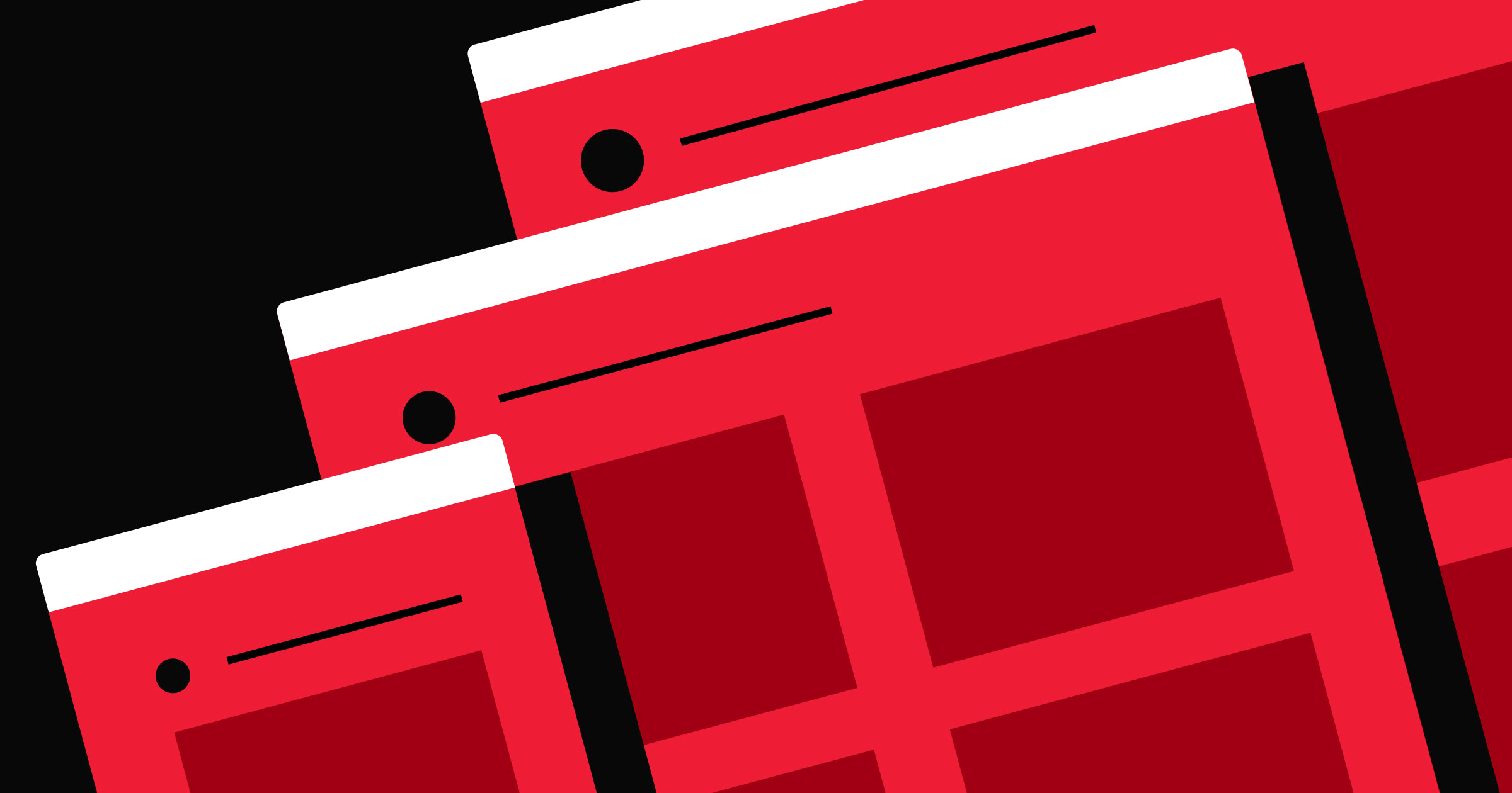
By using parallax scrolling, background layers shift at different speeds as visitors scroll, creating a sense of depth that transforms a flat page into something immersive and alive. The effect does more than look good. It naturally guides the eye toward what matters most — like a bold headline, a key message, or a call to action (CTA) — so visitors stay engaged, and your content lands with more impact.
In this blog post, we’ll dive into the basics of parallax scrolling and share 11 websites that incorporate this effect to engage and wow visitors — without sacrificing user experience.
Note: This guide reflects current parallax scrolling patterns and browser behavior as of 2026.
What is parallax scrolling?
Parallax scrolling is a visual technique in which background content moves at a different speed from the foreground. The contrast creates depth and draws attention to key elements, giving your website a more layered feel.
How parallax scrolling works
Parallax scrolling taps into a quirk of human perception: objects closer to the viewer appear to move faster than those farther away. This optical illusion has long been used to create depth and movement across many visual media, from classic animation to video game design.
For web developers, the principle translates into a more immersive browsing experience. By separating content into layers (background, midground, and foreground) and scrolling each at a different speed, the page takes on a sense of depth and motion. CSS, JavaScript, and browser rendering techniques handle the positioning under the hood, keeping the effect fluid without overwhelming the user.
More advanced implementations may also adjust scale, opacity, or direction to enhance the effect.
Types of parallax scrolling effects
There are several types of parallax scrolling effects, ranging from simple to more advanced. Let’s take a look at the most common ones:
- Parallax background: A background image moves more slowly than foreground content using CSS or scroll-based positioning. This is the most common approach.
- Layered parallax: Multiple layers move independently to create a more immersive, multi-depth effect. This is common in storytelling pages or landing pages.
- Fade-in parallax: Similar to the parallax background, this effect adds a fade-in so that content fades away as users scroll past it.
- Zoom parallax: Elements (or layers) scale up or down as the user scrolls, further enhancing the sense of depth in the experience.
- Mouse-based parallax: Instead of relying on scroll, elements shift in response to the user’s cursor movement. This creates a dynamic, interactive sense of depth.
How to create a simple parallax scrolling effect
From pure CSS implementations to JavaScript libraries, there are many ways to create parallax scrolling effects, each offering a different balance of complexity, performance, and flexibility. The right approach depends on how much control your design needs. Let’s take a closer look at the most common approaches:
Option 1: CSS background parallax
If you're coding manually, you can update background-position on scroll so the background shifts at a slightly different rate than the content above it. You can also use background-attachment: fixed on the background layer to keep the background static as a user scrolls. While CSS allows you to quickly create a parallax effect, it comes with real tradeoffs. Creating a convincing parallax effect requires significant manual finessing, browser support is inconsistent, and you'll hit a ceiling on what's actually achievable.
Option 2: Layered transform parallax
In this approach, different elements move at different speeds as the user scrolls. This is typically done by structuring your layout into different layers (e.g., background, midground, foreground), updating their position using CSS properties (like transform), and using JavaScript or open-source animation libraries to sync movement with scroll position.
It's more work to set up, but the payoff is a more realistic, consistent effect across browsers and platforms, with far greater control over how each layer behaves.
Option 3: Build it with Webflow
Tools like Webflow make it easy to create parallax effects without writing code. You can create, animate, and configure layers all through the canvas. You can also preview and adjust animations (including adding any accessibility constraints to turn off the animation for certain devices).
This approach is ideal for designers or non-technical stakeholders who want greater control over their effects without managing complex code.
Best practices: Performance and accessibility
While parallax scrolling can make websites feel more immersive and dynamic, it can also introduce usability and performance challenges if overused. Let’s take a closer look at these considerations.
Accessibility
Excessive movement in parallax effects may affect people with vestibular disorders, causing severe dizziness and disorientation. Before adding any parallax effects, follow these accessibility guidelines:
- Keep parallax effects to a minimum: Effects shouldn’t distract people from important information or cause disorientation.
- Restrict movement to small areas of the screen: Use parallax effects sparingly and place them in small pockets throughout the site for design variation.
- Include an option to toggle parallax effects: Add a slider or button so visitors can turn parallax effects on and off.
- Respect reduced motion preferences: Most operating systems allow users to opt out of excessive animation and motion through a reduced motion setting. Check the setting and reduce or disable the parallax effect accordingly.
Performance considerations
Parallax effects can impact performance, especially on mobile devices or lower-powered hardware. Poorly optimized effects can impact the user experience (e.g., creating scroll jank, choppy animation) and cause significant battery drain, especially on lower-end devices. Here are a few tips to create performant parallax scroll effects:
- Animate a few elements: Adding the parallax effect to too many elements can make the experience overwhelming and slow; be intentional about which elements you’re using.
- Be mindful of image size: If animating large images, consider compressing or resizing them to avoid issues.
- Use optimized animation properties: Prefer properties optimized for animation, such as transforms and opacity-based properties, to avoid triggering expensive relayout calculations.
- Prioritize testing older devices: Older devices have less powerful graphics cards, so what runs smoothly on a modern machine may jank or stutter on budget or aging hardware. Prioritize testing there.
10 parallax scrolling website examples
These examples show how parallax scrolling can elevate your website’s look and keep your audience engaged.
1. Recap After Use

One of Louie Sellers’ many talents as a forward-thinking user experience (UX) designer is an eye for interactions. In Louie’s website portfolio, Recap After Use, the site starts with a pen that uncaps and comes back together as you go from the top to the bottom of the page. This creative play on words takes an innovative approach to opening and closing a website.
The parallax starts with the pen and cap remaining consistent along the screen’s edges. As you scroll, subtle parallax effects show up on each featured project. Hovering over a project fills out the outline with details and shifts the image, giving it a sense of three-dimensionality.
Foreground images moving against a solid background color make them more prominent than when left static. The parallax effect brings attention to the surface-level elements and encourages you to click to learn more.
What to watch: How parallax effects across different layers are used to encourage users to keep scrolling and learn more about each project.
2. Jordan Gilroy

Jordan Gilroy’s personal portfolio website has a large, stylized “G” in the center of the page that highlights Jordan’s surname initial to boost brand recognition and awareness. A sticky menu in the top left provides navigation options throughout the browsing experience, while the other corners give you a glance at Jordan’s work to immediately showcase his expertise.
Scrolling splits the page open, revealing the first parallax effects as portraits of Jordan and his family overlap the background text. Jordan’s picture occupies the middle of the screen, providing a personal touch as he virtually introduces himself.
Below this picture, the section showcases Jordan’s work with thumbnails separated from blurred backdrops — another example of scroll-triggered parallax animations, as the blurred imagery brings foreground elements into focus. Toward the bottom of the site, the giant “G” returns in the background, creating a final parallax effect before a prominent “Connect” message encourages you to contact Jordan for work.
What to watch: How parallax effects are used to “reveal” new projects by refreshing the images and text on the page.
3. The Goonies

This website pays homage to the’80s movie “The Goonies.” Designed by Joseph Berry, it opens up with a stunning parallax that makes you feel like you’re peeping out from the bushes and zooming into the Oregon coastline where the film took place.
The parallax effect here isn’t very complex. White text appears modestly over the dark background, with colors drawn from images and cutouts to provide variation. By applying different speeds to the foreground and background images and enlarging them as you scroll, you create an attention-grabbing 3D effect while telling the story of “The Goonies.”
What to watch: How subtle scaling and speed differences between layers create a sense of depth and enforce the “zooming in” effect.
4. Okalpha

Published by Okalpha’s founder Grant Campbell, the creative design agency’s website makes a bold statement by pairing extra-large typography with loud color choices that are accentuated by the parallax effect: the elongated 3D square at the top of the website zooms in and out as you scroll, separating itself from the text covering it. Meanwhile, a 2D circle at the bottom of the page reveals contact details for prospective clients who want to hire Okalpha to create similarly vibrant designs for their brands.
The square and circle sandwich the rest of the content between the interactive design elements, like videos, services, and team members’ pictures. These shapes evoke specific emotions while adding a vibrant visual appeal to Okalpha's website.
What to watch: How parallax effects can complement bold, loud typography and colors to create a cohesive brand.
5. Jomor Design

Jonathan Morin revamped the Jomor Design website to create a new, minimalist design portfolio that follows modern design trends. But Jonathan retained the best part of the old site — parallax scrolling effects.
A lot is happening here. The large text blends into the changing images as you scroll, with backgrounds shifting from light to dark mode to full-screen photos. You can even toggle the colors with the button in the bottom-left corner.
Despite the many elements, the parallax effect brings everything together, making the site visually stunning without being overwhelming. Bold statements like “We’ll help you stand out & make all your dreams come true” pair with smaller-sized text like “As long as your dreams revolve around something like being the proud owner of a spectacular website,” subtly showing Jonathan’s fun side.
What to watch: How to use parallax effects to bring a webpage with multiple interactive elements together.


Interactions & animations
Learn how to animate multiple elements and bring your designs to life with rich, sequenced interactions and animations.
6. Parallax template

This parallax template by Jerome Bergamaschi features a brightly colored scene: green fields, magenta cliffsides, and orange and pink clouds slowly moving across the screen. As you scroll, the dark grass at the bottom appears to rise, changing the website’s background to dark shades of purple and revealing Jerome’s portfolio.
It’s an excellent example of fluid parallax scrolling. The attractive visuals grab attention and encourage you to scroll, then transition to the designer’s details and testimonials for those considering hiring Jerome.
What to watch: A simple use of fluid parallax scrolling done well.
7. Cerámica Colibrí

Cerámica Colibrí’s website, created by Sergio Martos, uses parallax scroll effects to highlight and market their products. “Colibri” translates to “hummingbird,” and scrolling down reveals a fluttering hummingbird that attaches itself to the text to complete the logo and highlight the company’s brand front and center.
As you continue to scroll, you’ll see a string of parallax effects, with text disappearing behind moving product images, creating an immersive, three-dimensional experience. Each product, from vases to vessels, has a title and description.
While the descriptions are static, the products overlay the text to produce a parallax effect and a more engaging browsing experience. You can also interact and change each product’s color.
A sticky timeline on the left side shows where you are on the page and lets you jump to any section quickly. Overall, the parallax effects, interactive colors, and practical navigation make Cerámica Colibrí a well-crafted business site.
What to watch: How to use parallax effects to create more engaging product overlays, great for e-commerce businesses.
8. Plink Webflow Rebuild

Plink’s official website caught the eye of developer and designer Bjorn Encuțescu, who decided to recreate its parallax effects in Webflow. Bjorn rebuilt the site for educational purposes and made the project cloneable for anyone who wants to experiment with it.
In addition to the parallax, you’ll see 3D illustrations and animation effects with text vibrantly popping into view. The parallax scrolling makes it feel like the site has two layers, each sliding over the other and appearing in turns as you browse.
What to watch: How to use parallax effects to guide user attention to key information (e.g., product value props) without overwhelming them.
9. Bake 003

Kai Jolly from the Finsweet team created Bake 003 as part of a collection of web design elements. This template showcases parallax scrolling using shapes and a three-color combination: white, dark gray, and green.
With a diverse array of shapes and space for your content, this design is an excellent one to clone for free and play around with. You can also change the colors and customize it for your own designs.
What to watch: How to create parallax effects across vertical layers by utilizing shapes and different color combinations.
10. Hard West II

The banner on the Hard West II website, designed by Psychoactive Studios, depicts four silhouetted characters charging toward a demon-like figure with skull-shaped smoke surfacing from its head.As you move your cursor, the characters on the screen shift accordingly. These elements immediately tell you what kind of game Hard West II is — dark, combat-heavy, and action-packed — while making you feel part of the action.
The demon-like figure is the banner's background element and moves independently from the foreground. Scrolling brings the demon closer as if it's charging toward you, the viewer.
Below, background screenshots and videos of in-game action provide a sneak peek of the gameplay while maintaining the engaging parallax effect. Meanwhile, a horizontal scrolling section protrudes from the shadowy background, allowing you to learn more about each playable character.
What to watch: How cursor-based movement and scroll-driven parallax work together to create a layered, interactive effect that pulls you into the scene.
Build parallax scrolling with Webflow
Parallax scrolling is a powerful way to add depth, guide attention, and create more immersive web experiences, but it can be complex to implement and optimize by hand.
With Webflow’s visual development platform, you can build parallax effects without managing custom code. Create layered interactions, control scroll speed, add advanced animations, and preview and adjust your designs—all through an intuitive interface. You can start designing immediately by choosing from thousands of cloneable templates from Made in Webflow. Plus, our blog offers guides for learning web design with modern UI/UX design examples, so you’ll never run out of inspiration.
Ready to create an immersive user experience? Try out Webflow today.
Build websites that get results.
Build visually, publish instantly, and scale safely and quickly — without writing a line of code. All with Webflow's website experience platform.