


Thoughtful button design keeps visitors moving through a website and engaging with its content.
Buttons may be small, but they play a critical role in how visitors understand and use a website. Well-designed buttons guide people to take important actions or follow pre-determined journeys by making each next step clear and accessible.
This guide covers the fundamentals of effective website button design. We’ll also highlight eight examples that showcase how to use buttons for both function and style.
What are the best practices for website button design?
Effective button design balances visual clarity with purpose. Buttons need to communicate their functions immediately and fit naturally into page layouts and styles. Here are some top tips.
Make your buttons prominent
Buttons need to be very visible and look like interactive elements. Visitors should know at a glance that they can click on the button and get a clear idea of where it will take them.
To make buttons stand out, you can use contrasting colors, shadows and borders, central placement, and hover animations. Whitespace also helps. Generous padding makes a button look distinct from surrounding elements and tells visitors it’s important.
Use button style to communicate function
If you have multiple types of buttons on a single page, you can vary their style to tell visitors what each one is for. For example, you could make the most important button, such as a signup call to action (CTA), larger than the rest and give it distinct colors or design elements.
Secondary buttons, like options to “Cancel” or “Learn more,” can be smaller and more in line with the surrounding background or text styling. Ghost buttons are especially useful if you want to include several in close proximity without overwhelming visitors or distracting from the main desired action.
Create a clear hierarchy
Especially on busy pages, you’ll want to use design elements to make sure important buttons aren’t missed. Color tells visitors where to look first. For example, a bright CTA button on a neutral page background draws the eye naturally.
Shape can reinforce that signal too, such as a button with rounded corners that stands out from nearby sharp-edged text boxes. Button size also matters, since large buttons command more attention.
Prioritize accessibility
Buttons should be just as usable for visitors using non-traditional input methods. Keyboard users need to move through your page with Tab and activate buttons with Enter or Space, while screen readers rely on clear labels that explain what each button leads to. Good color contrast helps vision-impaired visitors interact with buttons.
Button font size and weight are also important for readability, so opt for clear, web-safe typefaces when possible. Finally, don’t forget to design for the mobile experience, since buttons can be hard to tap if they’re too small or too close to other elements.
Make sure buttons look interactable
To tell visitors that a button is interactable and how it can be used, consider adding:
- Hover animations to show that a button is clickable, usually with a color shift or added shadow.
- Focus states that help keyboard users see which button they’re about to activate.
- Button toggles so visitors can see whether an option is on or off.
- Gray or fade designs to indicate when a button is disabled or not relevant.
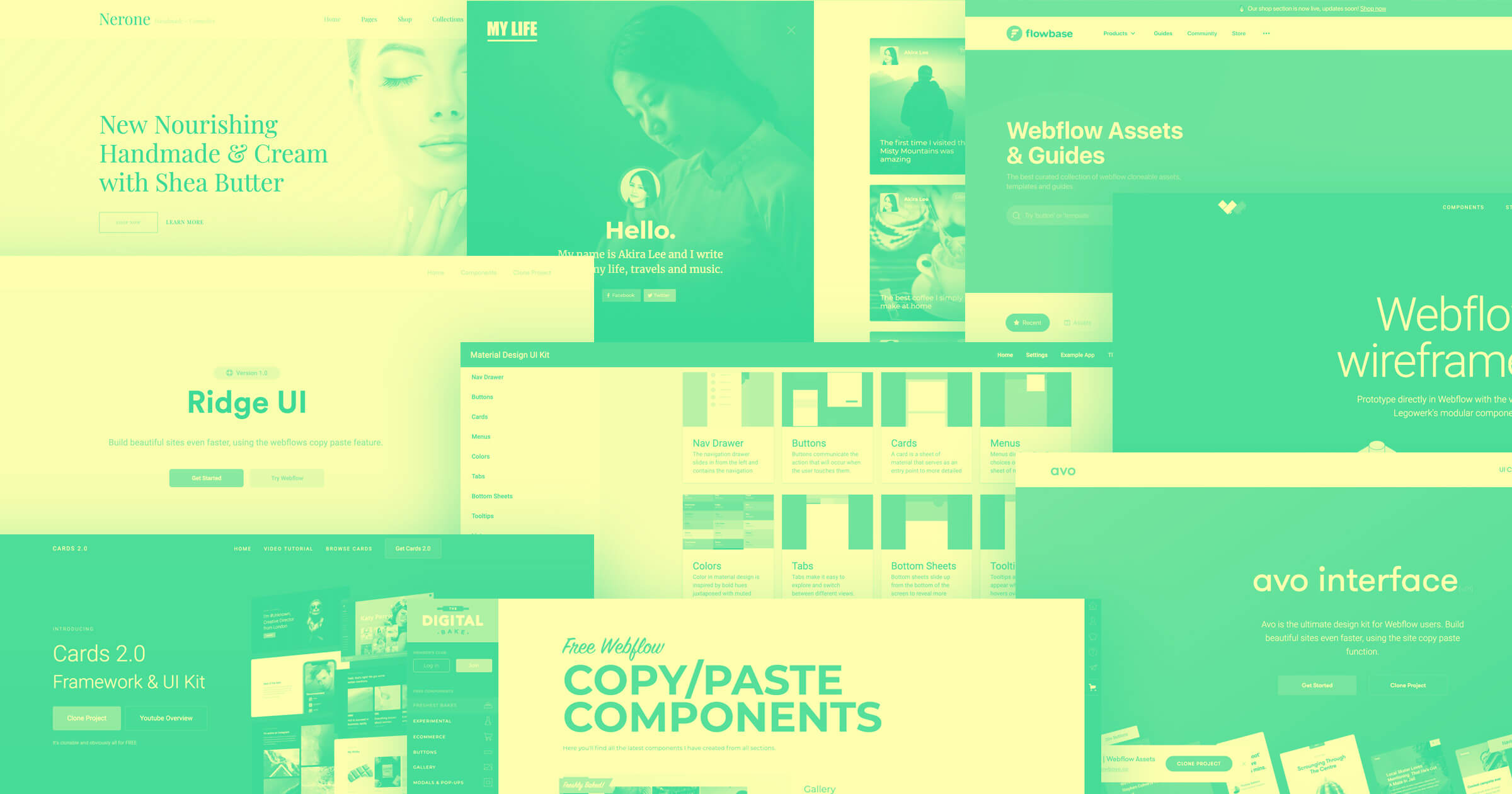
8 website button design examples to inspire your next project
These eight sites demonstrate various ways to use button design to ensure web pages achieve their goals.
1. Oddit
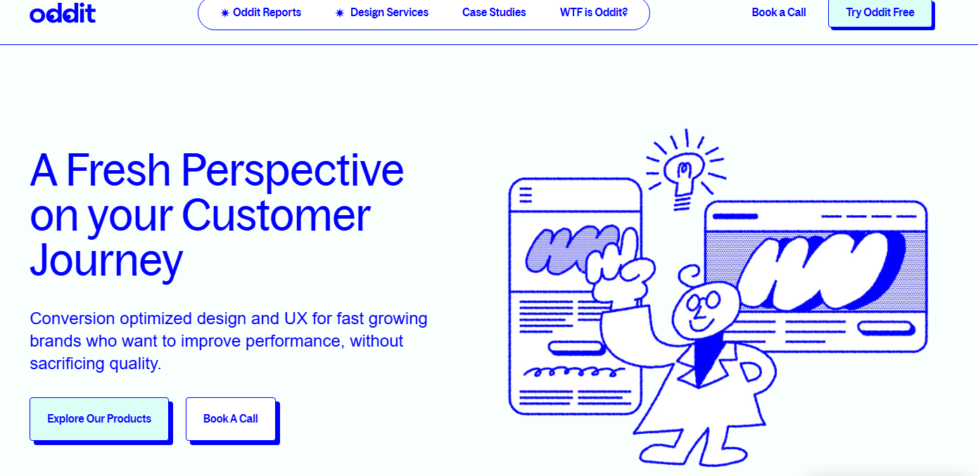
Oddit’s CTAs mimic physical buttons, with thick blue borders and offset shadows that give them a raised look. If you hover over one of these elements, it appears to sink down, closing the gap with its shadow.
This makes it very clear that the button has been activated, and provides a satisfying and responsive bit of interaction. Plus, the thick borders and strong shadows help the buttons stand out against the clean light background and make it possible for those buttons to use light fill colors that match the brand’s visual identity.
2. Darkroom
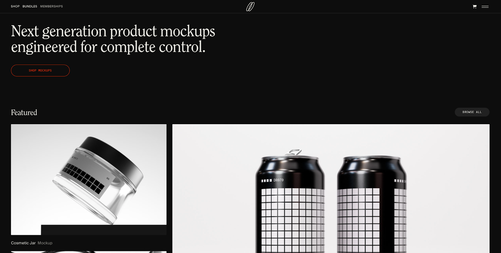
Darkroom’s website is very minimal, with a black background, concise white text, and simple square visuals. The buttons fit that aesthetic, using familiar pill shapes without much visual flair.
Still, the buttons stand out because they’re two of the few colored elements on the entire page. The initial “Shop Mockups” button uses a dark red text and border and a brighter red fill on hover. Further down, the “Learn More” button is bright yellow. Even if you’re scrolling down quickly, the color contrast makes these buttons very hard to miss.
3. WorkMade
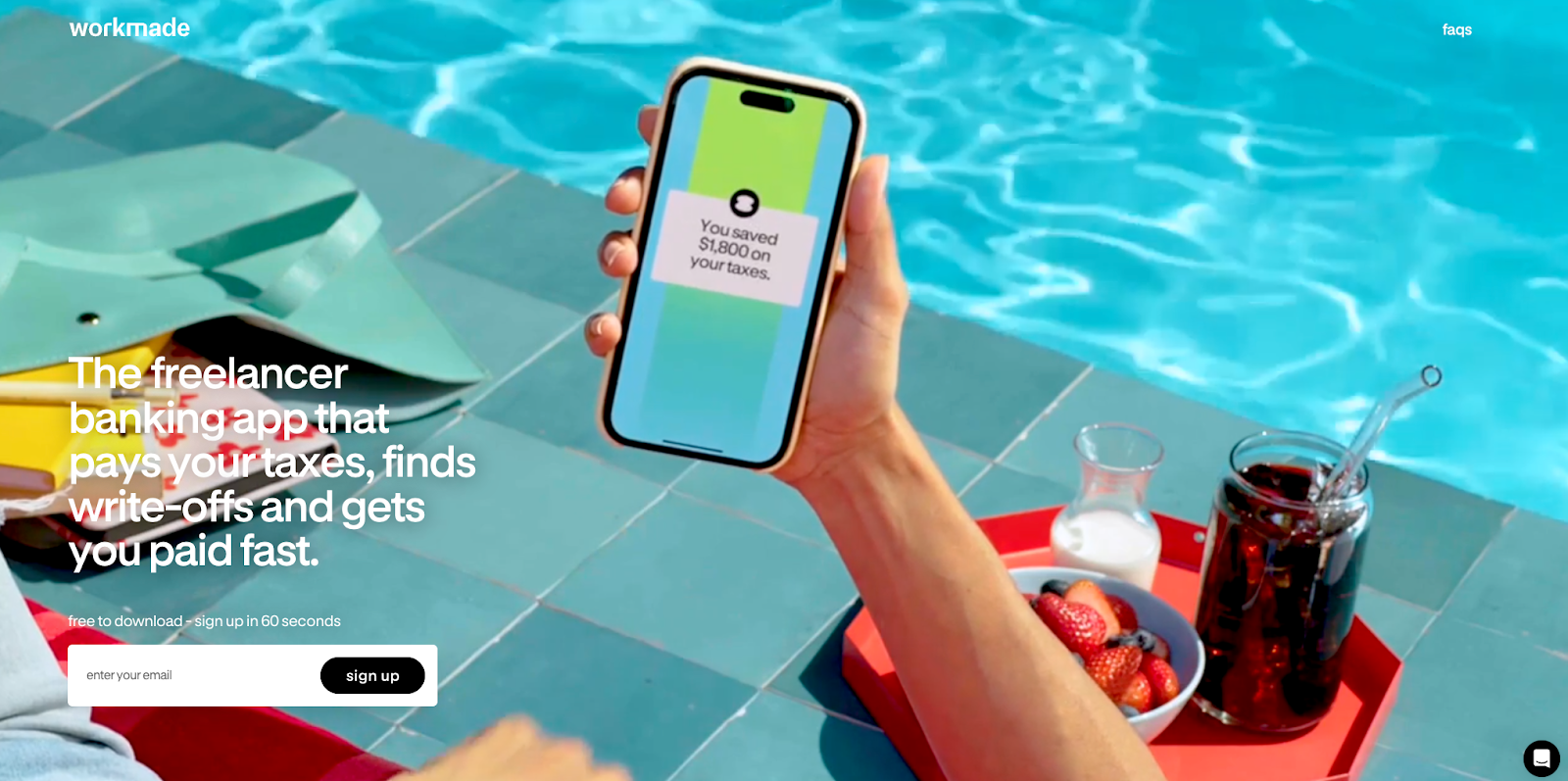
WorkMade’s website, created by SJ Design & Development, is brightly colored and full of motion. The large hero image plays an animated loop. The header text is big and white against the background’s blues.
This designer opted for a simple CTA button, with a black background that might be lost on most sites but stands out here. The concise label reads “sign up” in lowercase white letters. The generous spacing around the button adds prominence. On an otherwise visually exciting site, this minimal button design provides contrast that grabs attention.


The modern web design process
Discover the processes and tools behind high-performing websites in this free ebook.
4. Monad
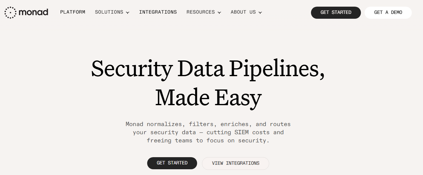
Monad’s pill-shaped buttons have text that animates on hover. The letters lift up one by one, then drop back down when you move the cursor away. These rising letters catch the eye. The staggered timing encourages people to read the button’s text so they know where it leads.
Each button also has a colored glow, which differs based on function: bright green for the primary action (“Get Started”) and light orange for the secondary action (“View Integrations”). This tells visitors which button matters most and offers subtle encouragement if they’re not sure what to click.
5. Hurry Up & Have Fun

Hurry Up & Have Fun’s website, designed by Graphics Dept., uses navigation buttons with very contrasting styles: a pink square right next to a yellow circle. On hover, the button colors flash through various bright shades, looking like disco lights.
If you scroll down the page, you’ll see the circular button’s text rotate. This draws attention to the important “Inquire” CTA. These unconventional choices are perfect for this party planning company, reinforcing the brand’s style and their claim of “injecting joy and authenticity” into their events.
6. Distributional
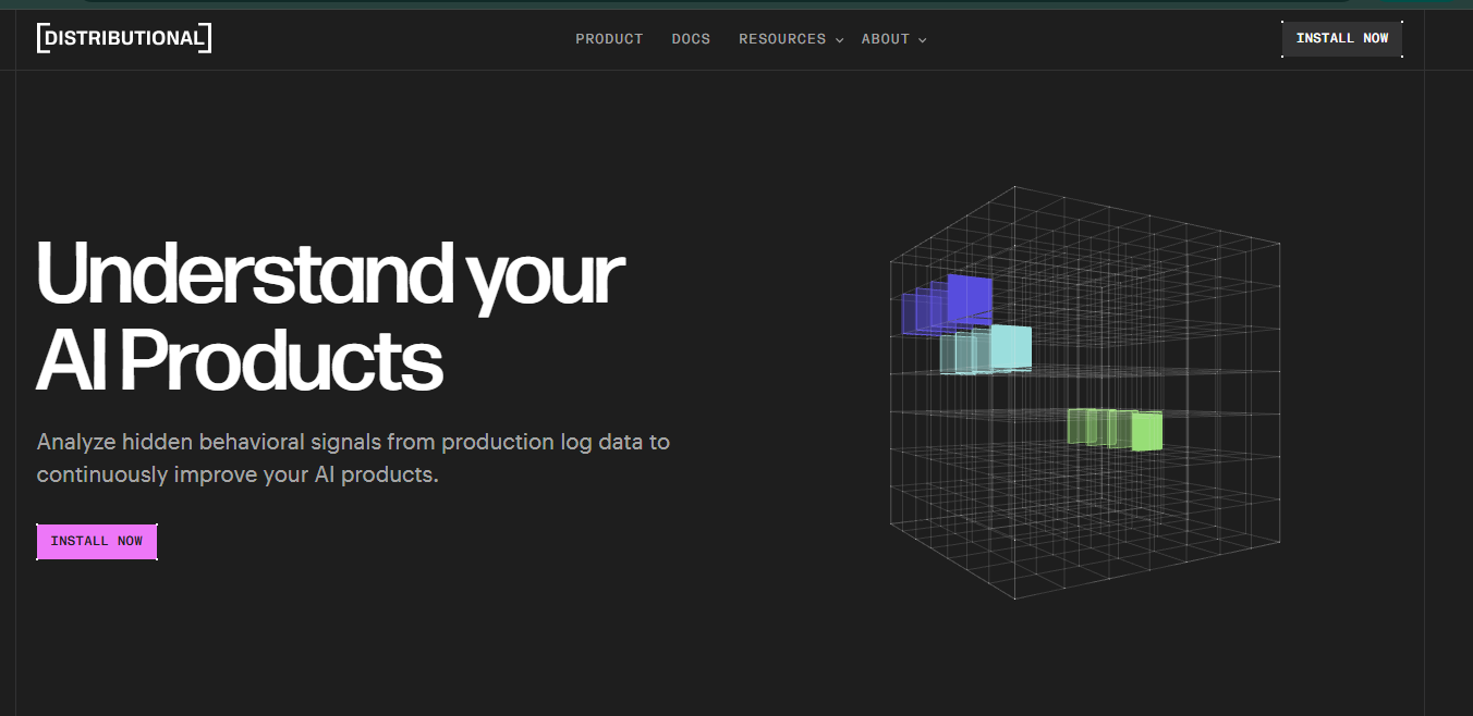
Distributional’s rectangular “Install Now” button sits on a dark background, drawing attention immediately with its bright pink fill. The small corner markers rotate on hover, providing interaction and matching well with the rotating 3D data visualization to the right.
While the color makes this button pop, the rest of its design fits with the page thanks to its small size and sharp angles. The consistency and simple styling provide a technical look to match this AI analytics product and reinforce the page’s interface-like style.
7. Airborne Studio
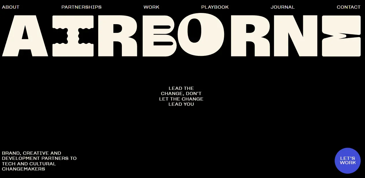
Airborne Studio’s primary button sits at the bottom-right corner of the page, with a circular blue design and the text “Let’s work” in a white sans-serif font. Although its placement could make it easy to miss, this colorful button stands out on the otherwise minimal black-and-white page. It also sticks in place as you scroll down.
On hover, the text transforms into a smiley face. Since most agency sites keep their CTA buttons serious, the smile is a distinctive element that makes this brand feel memorable and friendly.
8. TechTO
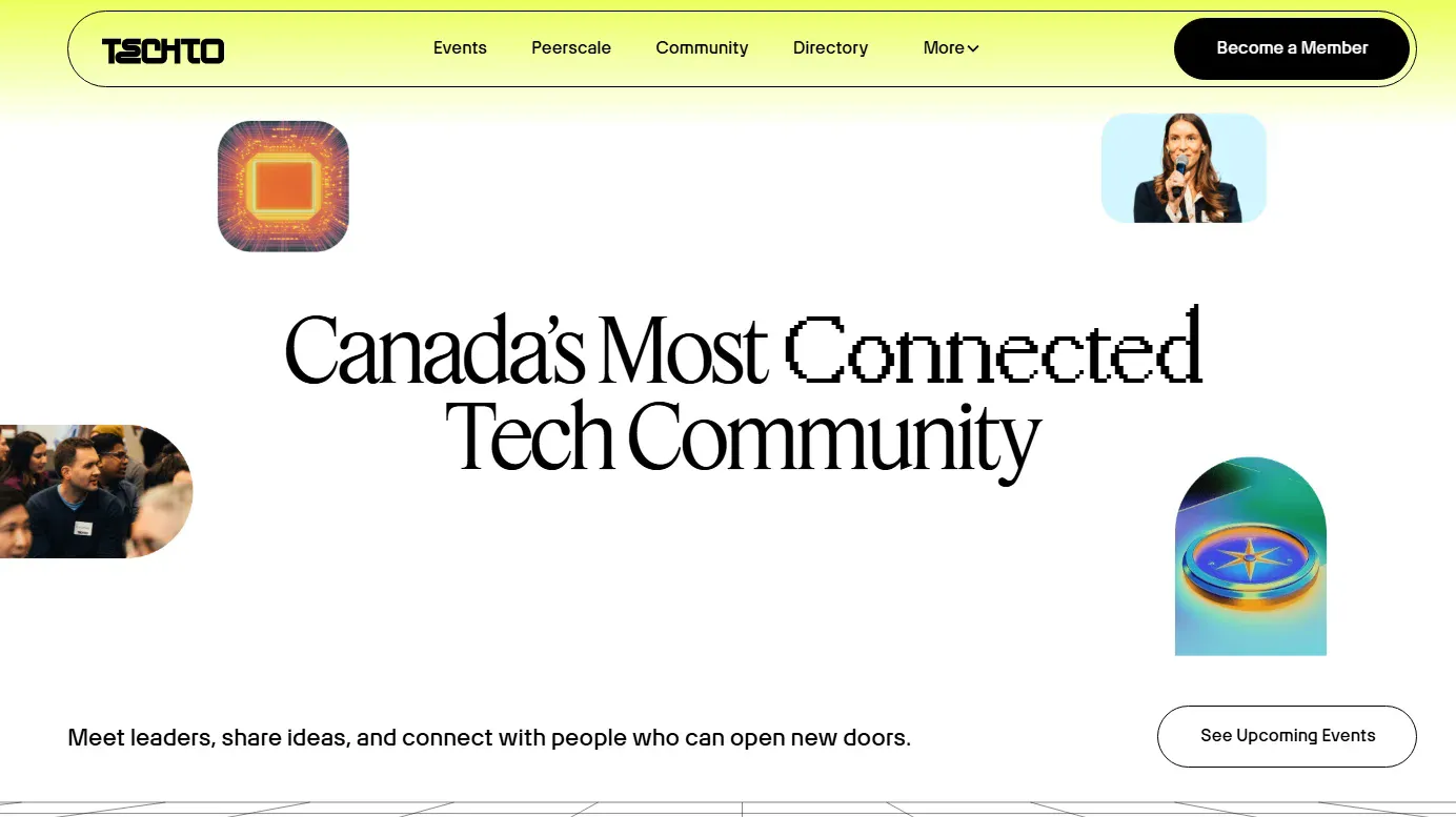
TechTO’s “See upcoming events” button looks very simple at first, just a standard pill shape with a white background and black text. But on hover, the button vibrates and its background shifts to bright yellow.
Most hover effects subtly change color or add shadows, but this more dramatic animation rewards the user with interaction that feels tactile. It also adds a sense of motion, making the CTA seem active and urgent. This is appropriate for a brand running a fast-paced tech community and promoting upcoming events.
Design effective website buttons with Webflow
Website buttons do a lot of work. They tell visitors where they can go and guide them toward the information they need. Strong design choices, such as color contrasts and hover states, make buttons prominent and usable, enabling them to play their roles effectively and support the intended user experience.
When you build a site with Webflow, you get complete control over every UI element. Webflow’s visual canvas helps you create custom buttons with hover effects and animations and tweak their designs to match each site’s overall branding. Customizable page structures let you place buttons carefully for maximum effect.
Create website buttons that convert with Webflow

Build websites that get results.
Build visually, publish instantly, and scale safely and quickly — without writing a line of code. All with Webflow's website experience platform.